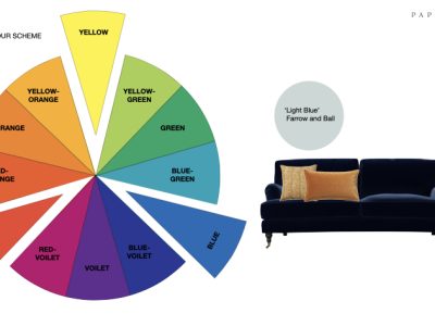
How to Use Color Theory in Interior Design
Color is one of the most powerful tools in interior design. It has the ability to influence mood, perception of space, and overall comfort. A well-chosen color scheme can make a room feel calm, energetic, spacious, or cozy. This is why color theory is a fundamental subject in professional interior design education.
At Unnati School of Design, Jodhpur, students are trained to use color not just for decoration, but as a functional and psychological design element. Understanding how warm, cool, and neutral colors work together is essential for creating balanced and harmonious interiors.


What Is Color Theory in Interior Design?
Color theory is the study of how colors interact with each other and how they affect human emotions and behavior. In interior design, color theory helps designers make informed decisions rather than relying on guesswork.
It includes:
The color wheel
Color harmony
Warm, cool, and neutral tones
Psychological impact of colors
Professional interior designers use these principles to design spaces that are visually pleasing and practical for everyday use.
Many students make the mistake of choosing an institute only based on advertisements. In reality, the best interior design institute in Jodhpur is defined by training quality, not marketing.
Understanding the Color Wheel
The color wheel is the foundation of color theory. It helps designers understand color relationships and combinations.
Basic categories:
Primary colors: Red, Blue, Yellow
Secondary colors: Green, Orange, Purple
Tertiary colors: Mix of primary and secondary colors
Using the color wheel, designers can create:
Monochromatic schemes (one color, different shades)
Analogous schemes (neighboring colors)
Complementary schemes (opposite colors)
These combinations help maintain visual balance in interiors.
Warm Colors: Creating Energy and Comfort
Warm colors include red, orange, yellow, and their shades. These colors are associated with energy, warmth, and activity.
Where to use warm colors:
Living rooms
Dining areas
Social spaces
In residential interiors in cities like Jodhpur, warm tones are often used to create welcoming spaces that suit the local climate and lifestyle. However, warm colors should be used carefully—too much can feel overwhelming.
Professional designers balance warm tones with neutral shades to maintain comfort.
Cool Colors: Calm and Relaxing Interiors
Cool colors include blue, green, and purple. These colors create a sense of calm, relaxation, and freshness.
Best spaces for cool colors:
Bedrooms
Bathrooms
Study areas
Cool colors visually recede, making small rooms feel more spacious. This makes them ideal for compact urban homes, which are increasingly common in Jodhpur.
At Unnati School of Design, students learn how to use cool tones strategically to create peaceful and functional interiors.
Neutral Colors: The Backbone of Professional Interiors
Neutral colors include white, beige, grey, cream, and brown. These colors are extremely important in interior design.
Why neutrals matter:
They balance strong colors
They create timeless interiors
They allow flexibility in décor
Most professional interiors start with a neutral base and then add color through furniture, fabrics, or accessories. Neutral palettes are especially popular in modern homes and commercial spaces.
Color Psychology in Interior Design
Each color affects human emotions differently:
Blue: Calm, trust, relaxation
Green: Balance, nature, freshness
Yellow: Happiness, energy
Red: Passion, strength
Grey: Sophistication, neutrality
Understanding color psychology helps designers create interiors that match the purpose of the space. For example, a bedroom should feel restful, while a workspace should encourage focus.
Balancing Colors for Harmony
One of the most common mistakes beginners make is overusing strong colors. Professional designers follow balance rules such as:
60% dominant color
30% secondary color
10% accent color
This rule creates visual harmony and prevents the space from feeling chaotic.
Students at Unnati School of Design, Jodhpur practice these principles through real projects and practical assignments, which helps them develop confident color sense.
Common Color Mistakes to Avoid
Using too many bold colors
Ignoring natural light
Choosing colors without testing samples
Following trends blindly
Good interior design is not about trends alone—it is about context, function, and user comfort.
Common Mistakes Students Make in AutoCAD
❌ Drawing without scale
❌ No layer management
❌ Overcrowded drawings
❌ Missing dimensions
❌ Poor file organization
Avoiding these mistakes improves drawing quality significantly.
Final Thoughts
Color theory is not optional knowledge for interior designers—it is a core professional skill. Understanding warm, cool, and neutral tones allows designers to create interiors that are not only beautiful but also functional and emotionally balanced.
Whether designing a small home or a large commercial space, mastering color theory helps designers deliver confident, client-friendly results. Learning these principles through professional interior design training at Unnati School of Design in Jodhpur prepares students to handle real-world design challenges with clarity and creativity.